We tend to think of film as roughly divided into the “black and white” and “color” eras, the latter ushered in by such lavish Technicolor productions as Gone with the Wind and The Wizard of Oz. But we also know it’s not as simple as that: those pictures came out in Hollywood’s “golden year” of 1939, but some filmmakers had already been experimenting with color, and the golden age of black-and-white film would continue through the 1960s. Movies today still occasionally dare to venture into the never-entirely-shuttered realm of the monochrome, but on the whole, color reigns supreme.

Even though most movies now use color, few use it to its fullest advantage. Color gives viewers something more to look at, of course, but it can also give a movie its visual identity. Think of the films you’ve seen that you can call back most vividly to mind, almost as if you had a projector inside your head, and most of them will probably have a distinctive color palette.
The most memorable cinematic images, in other words, will have been composed not just with any color they happened to need, but with a very specific set of colors, deliberately assembled by the filmmakers for its particular expressiveness.

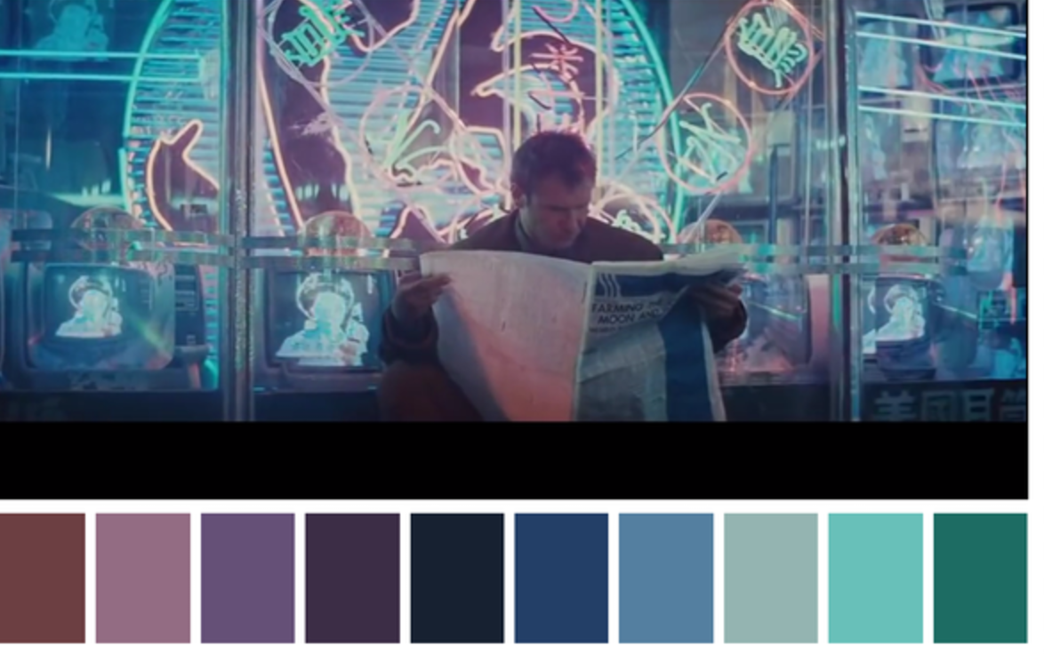
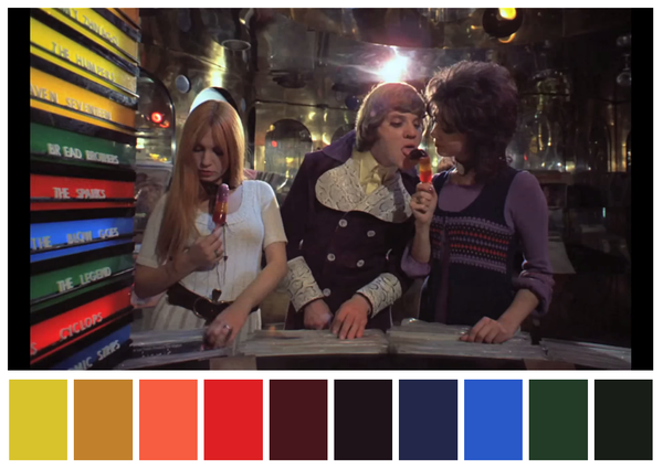
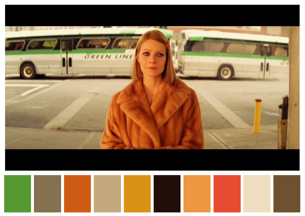
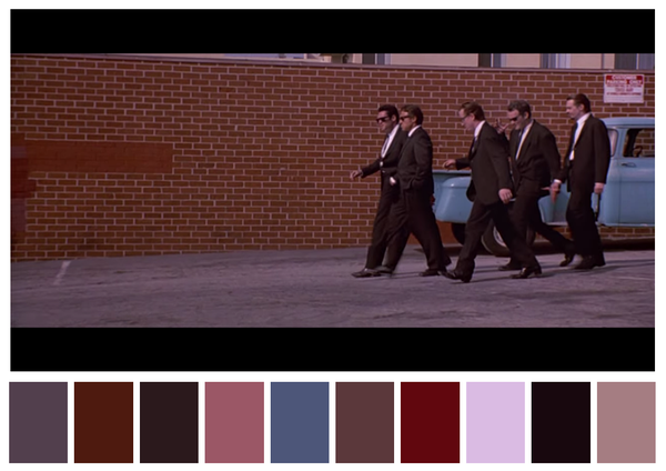
For a few years now, the Twitter account Cinema Palettes has drawn out and isolated those colors, ten per film, for all to see. “Though based on a momentary still, each spectrum of shades seems to encapsulate its movie’s overall mood,” writes My Modern Met’s Leah Pellegrini, pointing to “the somber, otherworldly blues of Harry Potter and the Deathly Hallows: Part 2, the dreamlike pinks and purples of The Grand Budapest Hotel, the cloyingly pretty pastels of Edward Scissorhands, and the earthly, organic greens and browns of Atonement.”

It will surprise nobody to see the work of Wes Anderson, famed for the care he gives not just to color but every visual element of his film, appear more than once on the feed. Here we see Cinema Palettes’ selections from The Royal Tenenbaums, as well as from Quentin Tarantino’s Reservoir Dogs, Stanley Kubrick’s A Clockwork Orange, and Ridley Scott’s Blade Runner. The project reveals an aspect of filmmaking that few of us may think consciously about, but nevertheless reflects the nature of cinema itself: the best films select not just the right colors but the right aspects of reality itself to present, to intensify, to diminish, and to leave out entirely.
Explore more films and colors at Cinema Palettes.
via My Modern Met and h/t Natalie W‑S
Related Content:
“Bleu, Blanc, Rouge”: a Striking Supercut of the Vivid Colors in Jean-Luc Godard’s 1960s Films
Wes Anderson Likes the Color Red (and Yellow)
Stanley Kubrick’s Obsession with the Color Red: A Supercut
Early Experiments in Color Film (1895–1935)
Based in Seoul, Colin Marshall writes and broadcasts on cities and culture. He’s at work on the book The Stateless City: a Walk through 21st-Century Los Angeles, the video series The City in Cinema, the crowdfunded journalism project Where Is the City of the Future?, and the Los Angeles Review of Books’ Korea Blog. Follow him on Twitter at @colinmarshall or on Facebook.


Leave a Reply