When disco pioneer Giorgio Morodoer released a colorized version of Fritz Lang’s Metropolis – featuring a soundtrack with Billy Squier, Pat Benatar and Adam Ant, no less – film purists everywhere howled with disbelief at how the film’s moody black and white had been turned into Easter egg pinks and blues. It felt like a gimmick and, worse, it just didn’t look real.
Colorization has come a long way since then. In the hands of the right Photoshop wizard — like artist Dana Keller — a colorized photograph of, say, the Oklahoma dust bowl or turn-of-the-century Coney Island gives viewers the chill of the uncanny. People and things that have long since departed this world suddenly seem vital and alive. It makes that foreign country called the past feel eerily familiar.
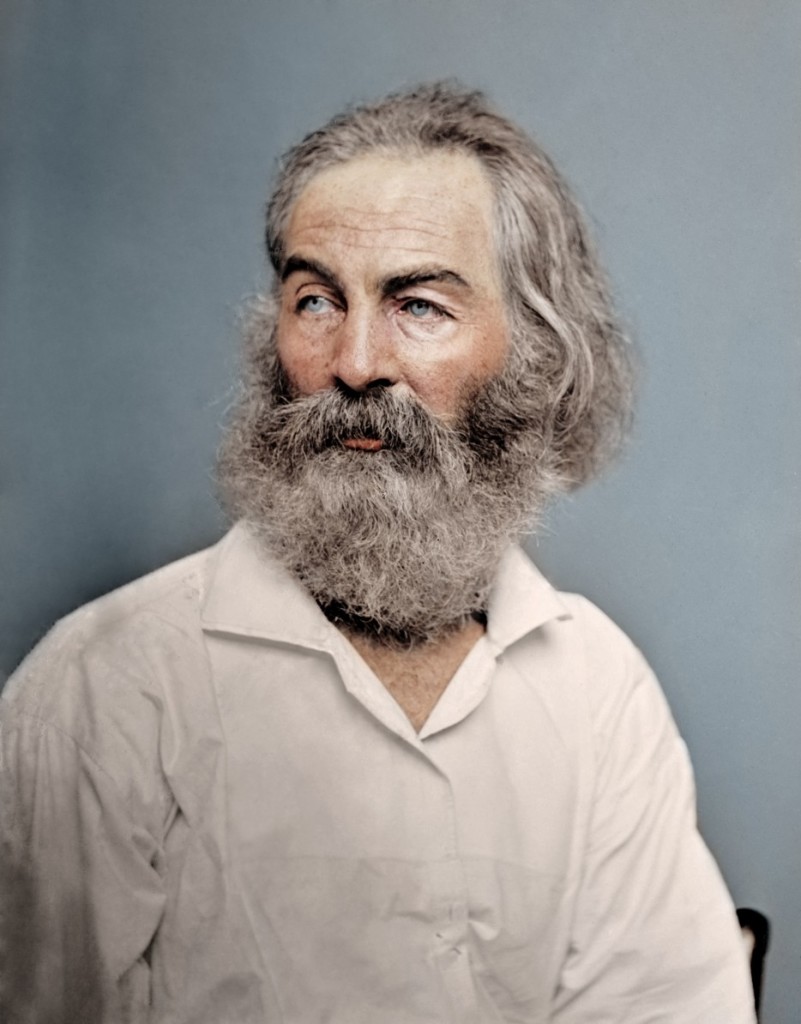
Above is a picture of poet Walt Whitman. His trademark long hair and Karl Marx beard would look right at home in certain corners of Portland. Apart from that, there is both a sensitivity and ferociousness about this picture. Whitman definitely looks like he’s capable of delivering a barbaric yawp. You can see what the picture looked like in its original black and white here.
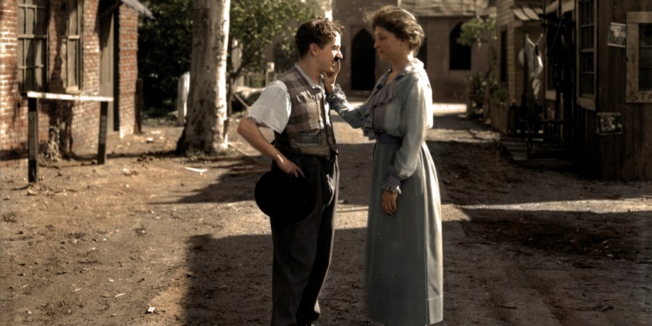
This photograph of Helen Keller drawing a hand over Charlie Chaplin’s face from 1919 looks like it could be a still from an upcoming Oscar bait biopic. In fact the picture was taken in Hollywood while Keller was on one of her speaking tours. (See original here.)
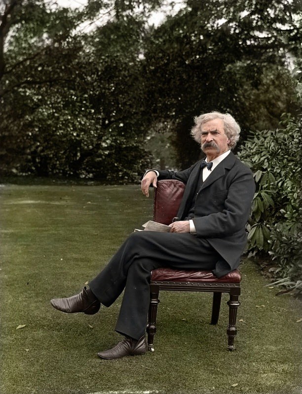
Likewise with this portrait (original here) of Mark Twain. You can almost hear him make some pithy comment like “A photograph is a most important document, and there is nothing more damning to go down to posterity than a silly, foolish smile caught and fixed forever.” As you can see from the picture, Twain didn’t take that risk, opting for more of a whiskery scowl.
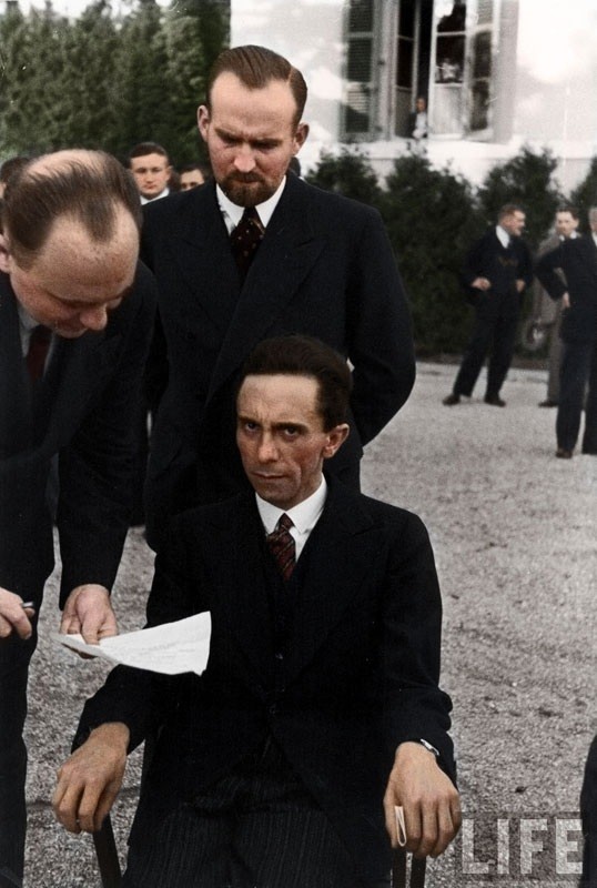
This picture of Joseph Goebbels (original) staring down a Jewish photographer is simply terrifying. It’s the sort of death stare common among psycho-killers, death row inmates and, apparently, Nazi propaganda ministers.
And this picture of a humble burger flipper from 1938 is so crisp that it looks like it might have been taken yesterday.
If you have an hour to kill, you can see many, many more colorized pics from the past over at Inspire 52.
A big H/T to Natalie W. G. for sending these our way.
Related Content:
Hand-Colored Photographs of 19th Century Japan
1923 Photo of Claude Monet Colorized: See the Painter in the Same Color as His Paintings
Mark Twain Writes a Rapturous Letter to Walt Whitman on the Poet’s 70th Birthday (1889)
Marilyn Monroe Reads Walt Whitman’s Leaves of Grass (1952)
Jonathan Crow is a Los Angeles-based writer and filmmaker whose work has appeared in Yahoo!, The Hollywood Reporter, and other publications. You can follow him at @jonccrow. And check out his art blog Veeptopus.


Great photos. However, I fear that I have become a dinosaur. I prefer the original black and white photos in every instance.
Adding color to these or any historic photos is pointless, self-indulgent endeavor.
Why ruin old photographs? I don’t see the point of painting by numbers.
Well I thought the project brought a lot for younger folks who see the past as an ancient memory.… I rather they see it as a peek at some ones yesterday…still vivid in recollection
Great works of art. In the Mark Twain picture, he seems especially alive and present. Never seen anything like that before. The color jumps out, freshens up the energy, livens up the personality. Beautiful artwork.
Its amazing how without color, the photograph from the past lacks, well, color! We see the people, we see the objects, but the color is not there. It is this absence of color that makes these old photos lose a very important aspect of the past visual information that is sought to be conveyed. This absence of color seems to affect us in forming an opinion about the past from seeing the (monochrome) image. It hinders in the formation of a true perspective. Our knowledge about the past is incomplete in a certain way. Moreover, the absence of color in these old photos seems to create a kind of distance–an artificial distance–between the present (in color) and the past (without color). There is a certain sense of “modernity” in the colored photographs of the present. We seem to think of the people in the B&W photos as belonging to some “old” period and the objects contained therein as “antique.” Perhaps this is due to the associations we form in our mind and perhaps I speak only of my own experience. Anyway, my personal view is that within the context of its own place and time, every person or object is “modern.” It is this perspective that seems to be lost when we view images from previous periods sans color. The vividness associated with a life that is both real and “new” is missing. Colorization of photographs seems to be an exciting new way to overcome or at least to compensate, in some measure, for this loss of “vividness information” that accompanies the photographs from the past. Colorization may enable one to form a truer perspective in one’s mind with respect to the people and objects of the past than if their images were recorded only in black and white. Moreover, colorization may enable one to see those people and those objects in the same way, in the same light that they were seen by their contemporaries. After all, their contemporaries did not see them in black and white! Therefore viewing the old photos in colorized form may aid us in forming a truer opinion of what an influence the color and charisma of these personalities may have exerted on the minds of their contemporaries. Color, after all, is an important component of reality and we miss this important sensory element in the monochromic photographs. Thus restoring color in old photos through colorization helps us to engage with and grasp the past in a better manner–in a manner that is more perspectival. It is amazing how “realistic” and “new”, how fresh and vivid old photos look after colorization! Take a look at this page:
http://www.openculture.com/2014/07/colorized-photos-that-bring-cultural-figures-back-to-life.html …
See the photo of the “humble burger flipper.” That is from 1938! How new! How complete in visual information! How vivid! It completely bridges the “distance” (of understanding) between the past and the present.