Scientific discovery is an engine of economic and military power, and America has long prided itself on its leadership in research. But as astrophysicist Neil deGrasse Tyson points out in this video, there are some dark clouds on the horizon.
When you look at the trendline, Tyson says, scientific research in America is clearly in a state of decline compared to other regions, like Asia and Western Europe. “As everyone else understands the value of innovative investments in science and technology in ways that we do not,” says Tyson, “we slowly fade.”
The maps Tyson uses are from Worldmapper.org. The one that he says represents change from “2000 to 2010” actually depicts growth in scientific research from 1990 to 2001. Danny Dorling, professor of Human Geography at the University of Sheffield and part of the team that created Worldmapper, confirmed Tyson’s error but said, “I think Neil’s got it roughly right. He should just have said ‘this is the trend to 2001 and it is not just likely it has continued, but it has probably accelerated.’ ”
Tyson’s comments are from a talk he gave in May at the University of Washington entitled, “Adventures of an Astrophysicist.” For a closer look at the maps he uses, see below.
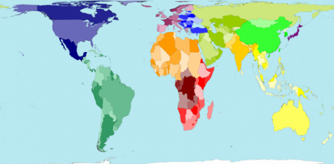
The color-coded world map above can be used for reference when studying the maps below.
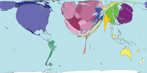
The map above represents territory sizes in proportion to the number of papers published in 2001 that were written by scientists living there. The number of scientific papers published by researchers living in America was more than three times greater than the number published in the second-highest-publishing country, Japan. For more information, including per capita data, see Worldmapper’s PDF poster.
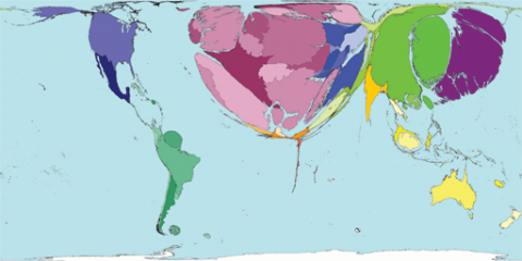
The map above represents the growth in scientific research between 1990 and 2001. Territory sizes are proportional to the increase in scientific papers by authors working in those countries in 2001 compared to 1990. If there was no increase during that period, the country has no area on the map.
Despite the fact that the United States had the most published research in 2001 and a net increase in research betwen 1990 and 2001, its size is smaller on the map because of a significantly greater growth rate by countries like Japan, the Republic of Korea, Singapore, China and Germany. Although the data behind the maps are now a decade old, Dorling suggests that a current map might look similar. “If I had to guess,” he said, “it would look worse for the USA given the massive cuts in funding in California to some of the major state Universities there.”
You can find more on this map, including a printable PDF poster with per capita data by country, along with information on the sources and methodology behind its creation, by visiting Worldmapper.
Maps © Copyright SASI Group (University of Sheffield) and Mark Newman (University of Michigan)


Cool. I learned the diffusion process for cartograms from the Gastner & Newman paper at UMich:
http://www-personal.umich.edu/~mejn/papers/
Paper file name is geocomp.pdf.
The mathematically illiterate will naturally have a great deal of trouble reading the paper.
all i see in these maps is university propaganda.
Measuring growth only is what screwed up the world economy. I doubt that it’s very helpful in science.
Any country that had zero scientific research before 1990 and has a bit now, will score high on the growth map. Whereas a country already doing well reasearch-wise will eventually hit the ceiling and won’t be able to grow anymore.
(I’m not saying this is the case for the US — yet. Just pointing out the possible pitfalls of this method of measuring progress)
Very good point, bonfils.
Still, this should strike a cord with folks. Especially when we have calls from some paranoid anti-science presidential candidates to cut education & science funding. We cannot stay a great force within the world without having a great education system & supporting scientific research. The countries on the edge (of such research developments) are the ones who stay ahead, it has been so throughout history.
There are two major factors that make the above presentation irrelevant.
1. The speaker measures research progress by using the quantity of research papers and studies as the primary metric.
As if the whole of the research community is locked in to Universities. Last I checked many of the best-and-brightest people that come out of higher education institutions are more likely to transition into commercial industry (where the fruits of their labor are actually implemented) than remain in schools writing papers.
Quantitatively the numbers look bad but how much of that research is being tested/used/proliferated in today’s industry compared to a few decades ago.
2. The word ‘scientific research’ itself in the traditional sense is becoming an antiquated term. What exactly does that represent? Taking an idea and running proof from start to finish to verify whether the hypothesis is true/false?
What about projects that use iterative development models such generational/evolutionary testing algorithms to achieve better results by advancing only the best/worst results of each iteration. Projects where there is no perceived end goal, just a constant progression to improve.
Or grassroots collaborative developments where tons of people contribute to projects to innovate using existing elements in new ways that follow a tree-branch open source model where a project may branch off in many different directions and only the most successful branches continue to grow/diverge where the less successful slowly die off and disappear. See http://www.rndiy.org/.
It’s like saying that cable TV is in decline because we don’t have 2000 channels; completely disregarding the internet and all other forms of media that we all create/consume on a wide range of platforms. The classic producer/consumer model doesn’t scale well over time.
We have successfully transitioned into a second age of enlightenment where information is finally free(read: freedom) for all. It would be nice if our educational institutions could update their curriculum and finally catch up to the rest of us. Less the propaganda…
I’m honestly surprised the speaker didn’t toss up a ‘hockey stick diagram’ for completeness sake ::sigh::.
“Anti-intellectualism has been a constant thread winding its way through our political and cultural life, nurtured by the false notion that democracy means that ‘my ignorance is just as good as your knowledge.’”
― Isaac Asimov